
Project Status - Live
Duration
Team Size
1.4 years - Present
2 UX Designers, 1 Product Owner, 1 Developer
Overview
University library websites are vital for accessing research materials and services, but a cluttered interface hindered usability. This project focused on redesigning navigation to simplify resource access and enhance the user experience.
The Problem
After extensive research, we understood these few things -
Department-focused navigation
Users needed to understand the org chart to find pages or services within departmental sub-structures.
Diverse user base
The website serves a broad audience, including students, faculty, alumni, researchers, and state residents.
User Categorization
Research suggested grouping users by library familiarity, using a matrix of tech skills, experience, project type, and support needs..
Our Strategy
Bridging the Gap
Clearly defined assistance options to connect users with the right support and material
Simplifying Navigation
Used action-oriented menu labels with transparent language to guide users effectively.
Optimizing the Homepage
Highlight top tasks to make the homepage a gateway to key resources.
Evaluating the usability of the current platform
To address these challenges, we conducted thorough testing to gain insights into user behavior and expectations regarding the old website. Our approach incorporated both stakeholder and user testing, ensuring a comprehensive understanding of how users currently interact with the website and their needs.
15+
10+
9
Interviews
Card Sorting Exercise
Treejack Tests
1
Homepage heatmap analysis
Key Findings
Intercept testing revealed users' main tasks on the website, allowing navigation to focus on their priorities.
Key Tasks Identified
Card sorting highlighted confusing labels, irrelevant items, and the need for updates like merging related options and adding useful tools.
Clearer Categories
Research found users prefer familiar terms like "find" over "search," leading to labels that feel natural and intuitive.
Language Users Relate To


Treejack Test
HeatMap Analysis

Card Sorting and Post task Interviews


The redesign and restructuring focused on essential actions such as library opening and closing times, as well as the "Plan Your Visit" section, which helped users book focus rooms or utilize the library more effectively.
Old Navigation bar
New Navigation bar
Renaming labels with clear, action-oriented language (e.g., "Visiting & Studying instead of "Spaces") and testing them with users for clarity.
The Design Process
Our research led us to ideas for improving navigation and the search experience. We restructured the navigation bar to make essential actions more accessible and visible based on insights from our heat map analysis.
Restructuring the Homepage for Clarity
Using treejack testing and heatmap analysis, we identified key user interactions and pain points on the homepage. These insights revealed which areas received the most attention and which were overlooked, guiding our decisions for restructuring.
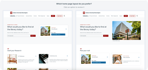
We created two homepage layout options and conducted a preference test with users to evaluate which design better met their needs. Feedback helped us identify the most intuitive and effective design elements.
New and Improved IU Libraries

Old IU Website
Impact Made
Reduced clutter and made navigation more efficient, leading to a noticeable drop in user frustration.
Made key menu items easier to access, creating a smoother and more seamless browsing experience across the website.
Improved usability by helping users quickly find relevant information, especially benefiting new users.
Things I learned…
Continuous Feedback and Testing
Regular refinement and testing are crucial for developing designs that evolve with user needs, technology, and changing content.
Listening to your users
Listening to users is essential for creating effective designs. Their input not only shaped better solutions but also ensured the design truly met their needs.
View More Projects

